In our series of blog posts, we’ve been talking about how SharePoint and cloud solutions have put sophisticated systems within reach of the small to mid-sized companies.
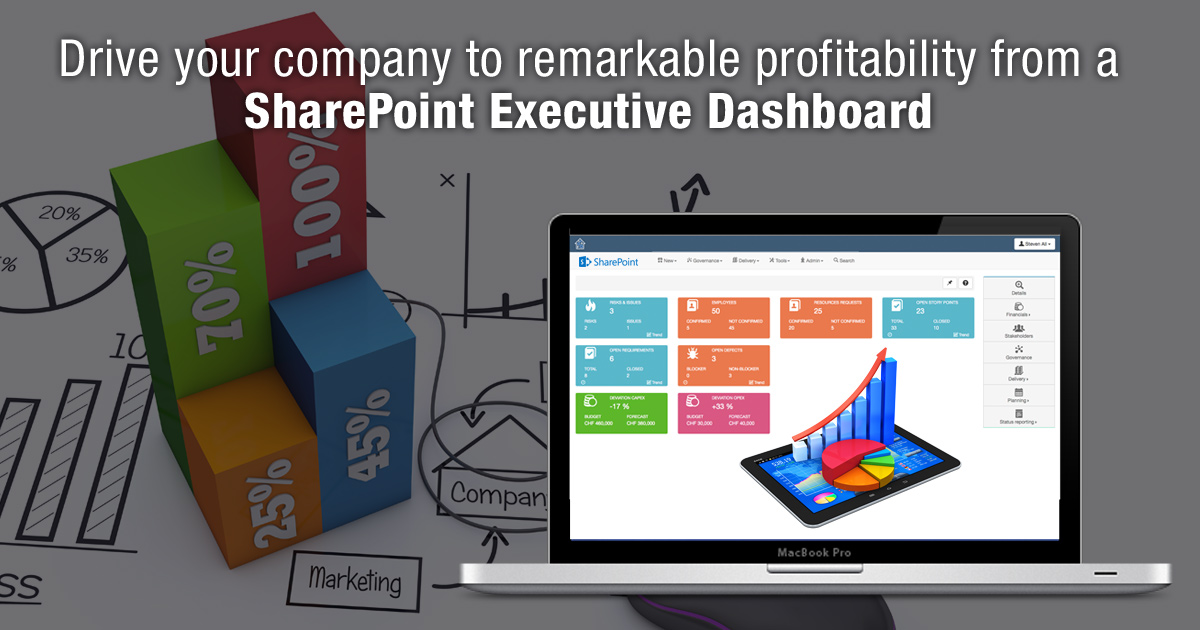
These solutions not only have the power to untangle the nitty-gritty of day-to-day operations so they flow more smoothly, but also to provide the big picture through an executive dashboard.
Your executive dashboard, that you can access anywhere, anytime, depicts at a glance your company’s key-performance metrics.

SharePoint Executive Dashboards
A SharePoint executive dashboard is a centralized visual display of key performance metrics and business data designed to give company leaders a clear and concise overview of their organization's operations. Think of it as a command center that provides executives with a quick snapshot of the company's health, allowing them to make informed decisions without wading through extensive reports.
The purpose of these dashboards is to offer high-level insights, typically using charts, graphs, and data summaries, to help executives monitor crucial business indicators, track progress toward goals, and identify trends or potential issues early on.
# SharePoint's Features That Support Dashboards
SharePoint is a versatile platform that integrates well with other Microsoft tools like Power BI and Excel. This flexibility allows users to create customized executive dashboards tailored to specific business needs. Key SharePoint features that support dashboards include:
1. Web Parts
These are modular components you can add to SharePoint pages. They allow you to embed various types of content, such as lists, documents, charts, and graphs, into your dashboard.
2. Lists and Libraries
SharePoint's list and library features let you organize data and documents, providing a source for the information displayed on the dashboard.
3. Integration with Other Tools
SharePoint works seamlessly with other Microsoft applications, allowing you to incorporate data from Excel or Power BI into your dashboard for enhanced analysis and visualization.
# Benefits of Using SharePoint for Dashboard Creation
Choosing SharePoint for your executive dashboard comes with several advantages:
1. Ease of Access
SharePoint is cloud-based, meaning your dashboard can be accessed from anywhere, at any time, using a browser or mobile device. This accessibility ensures executives can stay connected and informed, even on the go.
2. Centralization
With SharePoint, you can centralize your business data in one place. This centralization reduces data silos and provides a single source of truth for your organization, enhancing collaboration and communication among team members.
3. Customization
SharePoint offers extensive customization options, allowing you to design a dashboard that meets your exact needs. You can choose the types of data to display, the layout, and the level of interactivity.
4. Collaboration
SharePoint's collaboration features allow multiple users to work on the dashboard, enabling teams to share insights and work together to drive profitability.
5. Security
SharePoint includes robust security features, allowing you to control who can view or edit the dashboard. This control ensures that sensitive business data remains protected.
What You Might Discover on Your Dashboard
Your dashboard allows you, for example, to dig beneath your 20% sales growth for the year and find out what’s driving sales up. With a couple taps on your keyboard you can mine the data to discover what’s beneath the trend—whether it’s new customers, a growth segment, a new product or, perhaps, a sales representative who has found the magic formula.
Here are a few more examples of key performance indicators you might see in your dashboard.
- Your website processed 47 inquiries yesterday.
- Your company has 10 proposals due.
- Proposals already sent to clients represent 3500 hours of work.
- Your close ratio on proposals is 55%.
- Two out of three prospects are located in the U.S. and the rest are global.
- The campaign source for each of the inquiries.
- How many orders and how much revenue is generated from each campaign.
You can see how this data enables you to view your pipeline of business, predict future sales, duplicate your successes and grow your business. But that’s not all. Additional data can help you assure maximum productivity; stable cash flow; the status on hiring the new accountant; bottlenecks in new product development and more.
Building a SharePoint Executive Dashboard
Creating a SharePoint executive dashboard from scratch involves several steps, each critical to ensuring the dashboard is both functional and effective. Below is a detailed guide to building a SharePoint executive dashboard, covering the key features and best practices.
Step 1: Identify the Objectives
- Start by defining the primary goals of your executive dashboard. Consider what key information you need to track, such as sales, revenue, expenses, customer satisfaction, or employee performance.
- Determine who the dashboard is for. An executive dashboard should focus on high-level metrics for senior management, providing a quick snapshot of the business's health.
Step 2: Plan the Dashboard Structure
- Create a simple outline or wireframe of the dashboard layout. Decide how many sections or areas you'll need to display your metrics.
- Organize the dashboard so that the most critical information is prominently displayed, with secondary data available but less emphasized.
Step 3: Use SharePoint Features
Web Parts: These are building blocks for your dashboard. Use Web Parts to add charts, graphs, calendars, and other interactive elements to your dashboard. Select Web Parts that align with the data you want to display.
1. Lists
Use SharePoint Lists to manage and organize your data. Lists can be customized to hold information like sales figures, project timelines, or customer feedback.
2. Libraries
SharePoint Libraries are useful for storing documents, reports, and other files. They can be linked to your dashboard to provide easy access to supporting information.
3. Power Automate
This feature helps automate workflows, like sending notifications when certain thresholds are met or updating data from other sources.
4. Power BI Integration
For more advanced data visualization, consider integrating Power BI with your SharePoint dashboard. This allows you to create detailed charts and analytics.
Step 4: Select the Right Components
Choose components that effectively represent your data. For example:
1. Charts and Graphs
Use these to visualize numerical data. Line charts, bar graphs, and pie charts are popular choices.
2. Data Tables
Provide a detailed view of the data in table format, allowing users to explore the information at a granular level.
3. Key Performance Indicators (KPIs)
Use KPIs to highlight critical metrics, such as revenue growth or customer satisfaction.
Ensure the components are easy to understand and navigate. Avoid overloading the dashboard with too much information or complex visualizations.
Step 5: Implement the Dashboard
- Once you've planned the structure and selected the components, create the dashboard in SharePoint. Start by adding Web Parts to your preferred sections, then populate them with data from your Lists or Libraries.
- Customize the appearance of the dashboard to align with your company's branding, using colors and logos where appropriate.
Step 6: Test and Refine
- After building the initial version of the dashboard, test it with a small group of users, preferably executives or stakeholders.
- Gather feedback on the usability and effectiveness of the dashboard. Adjust the layout, components, or data sources based on the feedback.
- Ensure the dashboard is user-friendly design and works across different devices, including mobile and tablets.
Interested? To learn more about how to create processes and systems that enable you to scale your business, subscribe to this blog.
Call us at 484-892-5713 or Contact Us today to know more details about drive your company to remarkable profitability from a SharePoint executive dashboard.


