A properly constructed dashboard can make the difference between a good company and a great company by transforming large amounts of data into real-time, actionable insight into its performance. Dashboards incorporate predictive analytics to spot trends that otherwise might remain buried in data. These real-time reporting capabilities provide vital business acumen that facilitates agile, quality decisions.
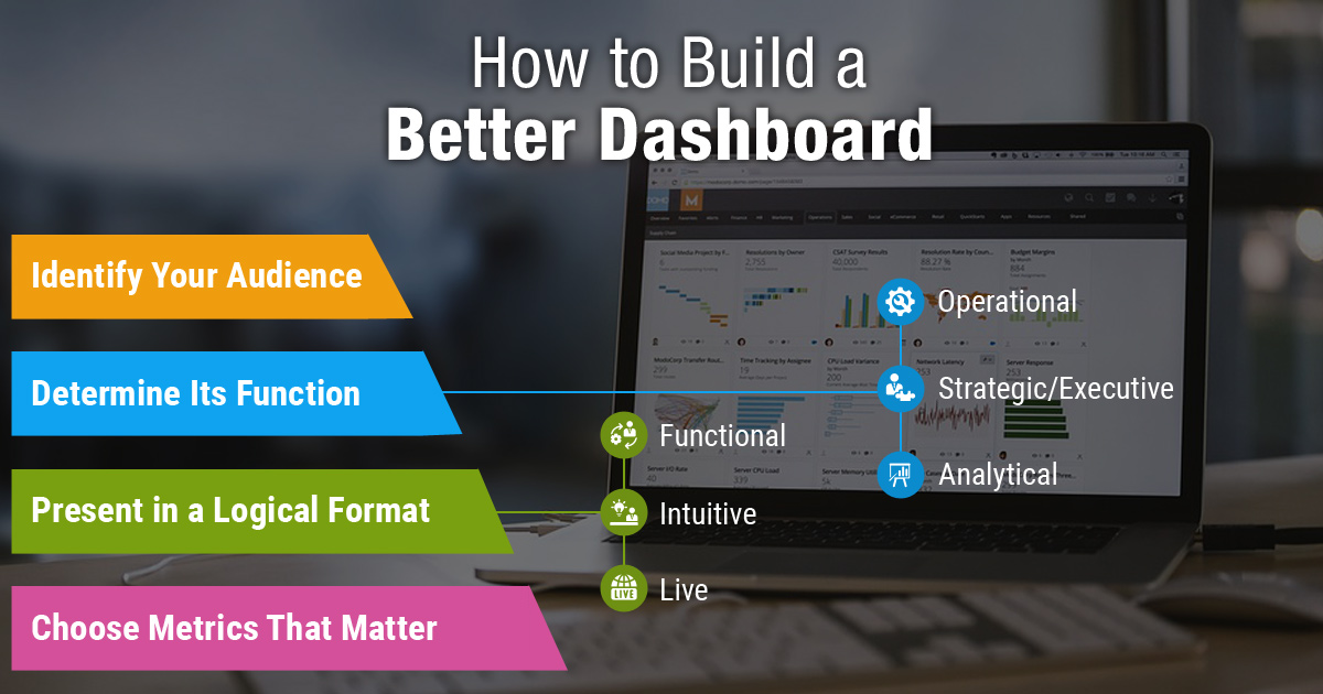
Dashboards are business intelligence (BI) applications/user interfaces that collect and present information in a simple, easy-to-understand format. By definition, dashboards are multifunctional, which means that they must both collect and present data effectively. Creating a dashboard that will be beneficial to your organization requires four carefully planned cornerstones: audience, type, format, and metrics.

Identify Your Audience
Identifying your audience is a crucial step that should never be underestimated. Understanding who will be using your dashboard or accessing your data is essential for creating a valuable and effective tool.
# Tailoring to Specific Audiences
Consider the unique requirements and expectations of each audience segment. Whether it's corporate management, the sales organization, customer support, or any other specific group, tailor your approach to their needs.
# Accessibility and Usability
The success of a dashboard lies not only in its ability to collect data efficiently but also in its accessibility and usability. Ensure that your audience can easily access and comprehend the information presented.
# Clean and Streamlined User Interface
Strive for a clean and streamlined design in your dashboard. A cluttered or confusing user interface will hinder its usefulness, regardless of the quality of the underlying data collection.
# Organizing and Presenting Data Effectively
Organize the data in a logical and intuitive manner, grouping related information together. Present the most relevant and actionable data prominently, allowing users to quickly grasp the insights they need.
# Incorporating Visualizations for Data Comprehension
Consider incorporating visualizations, such as charts, graphs, and infographics, to enhance data comprehension and make it more engaging. Visual representations can help users understand complex data more easily.
# Gathering Feedback and Iterating Design
Regularly gather feedback from your audience and iterate on your dashboard design accordingly. Understanding their evolving needs and preferences will enable you to continuously improve the dashboard's effectiveness and user satisfaction.
Determine Its Function
Every dashboard should have a clearly defined purpose. Typically, a dashboard-type will be aligned with your dashboard audience. You may require a dashboard that is a combination of types, but be careful of trying to include too much information. Here are the three most common dashboard types:
1. Operational Dashboard
An operational dashboard focuses on monitoring the day-to-day operational aspects of a business. It requires real-time and up-to-date information to provide accurate insights. Operational dashboards typically display key metrics, performance indicators, and operational data relevant to the ongoing activities of the organization. They are valuable for tracking progress, identifying issues, and making immediate decisions.
2. Strategic/Executive Dashboard
A strategic or executive dashboard is designed to provide high-level key performance indicator (KPI) information to company executives and decision-makers. These dashboards offer a holistic view of the organization's performance, typically covering a specified time range. They often include KPIs related to financial metrics, such as profits and expenditures, as well as other important strategic indicators. Executive dashboards help leaders assess the overall health of the company, identify trends, and make informed strategic decisions.
3. Analytical Dashboard
An analytical dashboard focuses on providing users with drill-down capabilities and the ability to explore data in-depth. These dashboards enable users to analyze and uncover insights by interacting with various data points and dimensions. They may incorporate interactive visualizations, filters, and advanced data exploration features. Analytical dashboards are particularly useful for data analysts, researchers, or users who require a deep understanding of underlying trends, patterns, and correlations within the data.
Present in a Logical Format
Presenting data in a logical format is crucial for creating an effective and user-friendly dashboard. The design and structure of a dashboard should minimize cognitive load, making it easy for users to understand the information presented. Here's a description of the structure and design elements of a great dashboard:
# Functional Design
A great dashboard has a functional design that effectively communicates information and assists users in achieving their goals. It should be organized in a way that aligns with the workflow and tasks of the users.
The layout should be intuitive, guiding users through the dashboard and presenting information in a logical manner. Functional dashboards prioritize the most important data and ensure that it is easily accessible, helping users make informed decisions and take appropriate actions.
# Intuitive Presentation
An intuitive dashboard presents information in a manner that is easily understandable at a glance. It uses clear and concise visualizations, such as charts, graphs, and tables, to convey data in a straightforward manner.
The design should employ meaningful and consistent use of colours, icons, and labels to help users quickly interpret the data. Intuitive dashboards minimize the need for extensive explanation or interpretation, allowing users to grasp insights effortlessly.
# Live Updates with Real-Time Data
A great dashboard provides automatic updates using real-time data whenever possible. Live dashboards ensure that users are accessing the most up-to-date information, enabling them to monitor ongoing activities and make timely decisions.
Real-time data updates can be particularly valuable for operational dashboards where immediate awareness of performance metrics is essential. By presenting real-time data, a dashboard becomes a dynamic tool that reflects the current state of the business, promoting agility and responsiveness.
Choose Metrics That Matter
Choosing the right metrics for your dashboard is crucial for its effectiveness. Here's how you can do that:
# Judiciously Select Relevant Metrics
Resist the temptation to measure and display every possible metric. Instead, focus on selecting only the most relevant metrics that align with your dashboard's purpose and the needs of your audience. By prioritizing key performance indicators (KPIs) and metrics that directly impact your business objectives, you can avoid overwhelming users with unnecessary information and keep their attention on what truly matters.
# Use Visual Cues for Differentiation
To enhance the clarity of your dashboard, leverage visual cues such as colour or white space to differentiate information from adjoining areas. Clearly distinguish different sections or modules within the dashboard to help users quickly identify and interpret the data presented. Consistent use of visual cues aids in maintaining a clean and organized layout, reducing cognitive load and improving the overall user experience.
# Avoid Excessive Granularity
While it may be necessary to include detailed or granular data in some cases, be cautious about overwhelming users with too much information upfront. If granular data is important, provide the option for users to drill down into the details when needed. This approach strikes a balance between providing high-level insights and enabling users to explore deeper levels of data, ensuring that the dashboard remains user-friendly and accessible to a wider audience.
# Maintain Fresh Data
Regularly updating the data displayed on your dashboard is crucial to its relevance and usefulness. Stale or outdated data can lead to inaccurate insights and hinder decision-making. Establish a process for data collection, integration, and updates to ensure that the dashboard reflects the most recent information available. Consider automating data refreshes whenever possible to provide real-time or near-real-time updates, enabling users to make informed decisions based on the latest data.
# Embrace Simplicity
In the words of Leonardo da Vinci, "Simplicity is the ultimate sophistication." Keep your dashboard design simple and intuitive. Avoid clutter and complexity by focusing on the most critical information and removing unnecessary elements. Strive for a clean and uncluttered interface that allows users to quickly understand the data presented and derive insights with ease. A simple and well-organized dashboard enhances usability and increases user adoption and satisfaction.
About Simtekway
As a leading BI solution provider, Simtekway has a proven track record of assisting organizations in their transformation into savvy companies that leverage BI to monitor performance, gain insights into future trends, proactively address issues, and capitalize on new opportunities. With our expertise and experience, we have helped numerous businesses unlock the true potential of their data.
Through our collaborative approach, we work closely with our clients to define their BI goals and requirements. Our team of technologies then design and implement robust BI architectures that integrate seamlessly with their existing systems and data sources. We prioritize user-friendly interfaces and intuitive dashboards that present information in a clear and meaningful manner, empowering users at all levels of the organization to easily access and interpret data.
With our leading-edge BI solutions, organizations can harness the full potential of their data assets, make data-driven decisions with confidence, identify emerging trends and patterns, mitigate risks, and seize new opportunities.


